Exploratory Data Analysis
This is the second post in a series on Himalayan mountaineering data. The first post introduced the dataset and its hierarchical structure. Here I'll walk through exploratory data analysis—the part where you get to know the data before fitting models.
I'm a believer in thorough EDA. Not because it's intellectually glamorous, but because it catches problems early. Missing data patterns, outliers, unexpected correlations—these are easier to handle when you've seen them rather than discovered them through mysterious model failures.
Missing Data Patterns
Missing data is usually the first thing I check. Not just "how much is missing," but where and why.
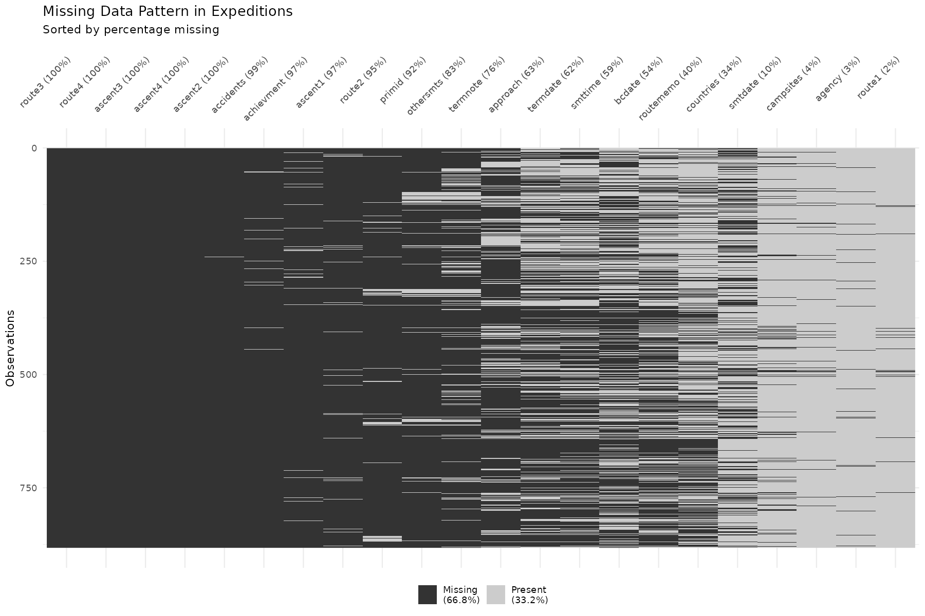
A few observations:
-
Route information has substantial missingness. This makes sense—some expeditions take standard routes that don't need annotation; others take novel routes that should be documented but aren't.
-
Date fields (summit date, base camp date) have varying completeness. Expeditions that failed early may not have summit dates recorded at all— which is informative missingness, not random.
-
Deaths are coded as 0 when no deaths occurred, so missing deaths likely means "unknown" rather than "zero." This distinction matters.
The pattern of missingness can be a feature itself. If summit_date is missing,
that's highly predictive of failure—you can't have a summit date without
summiting. Whether to encode this as an indicator variable depends on your
modeling goals.
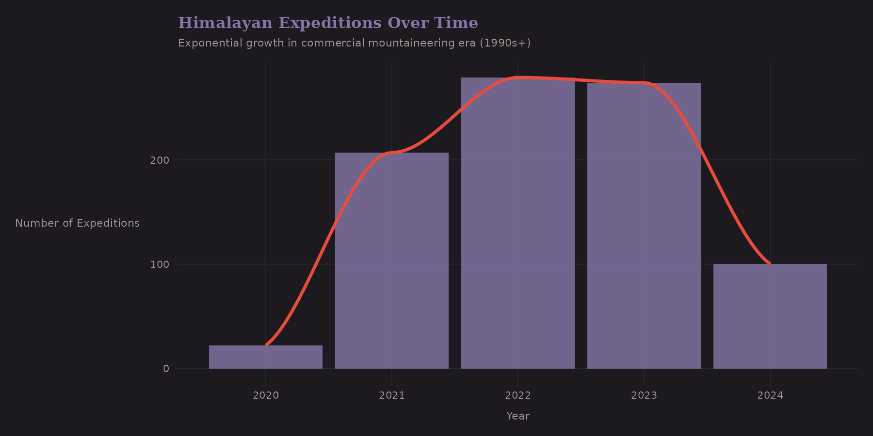
Temporal Trends
The Himalayan climbing scene has changed dramatically over decades. This dataset covers 2020-2024, a specific window that includes:
-
COVID-19 disruptions (2020-2021)
-
The recovery boom (2022-2024)
What about success rates?
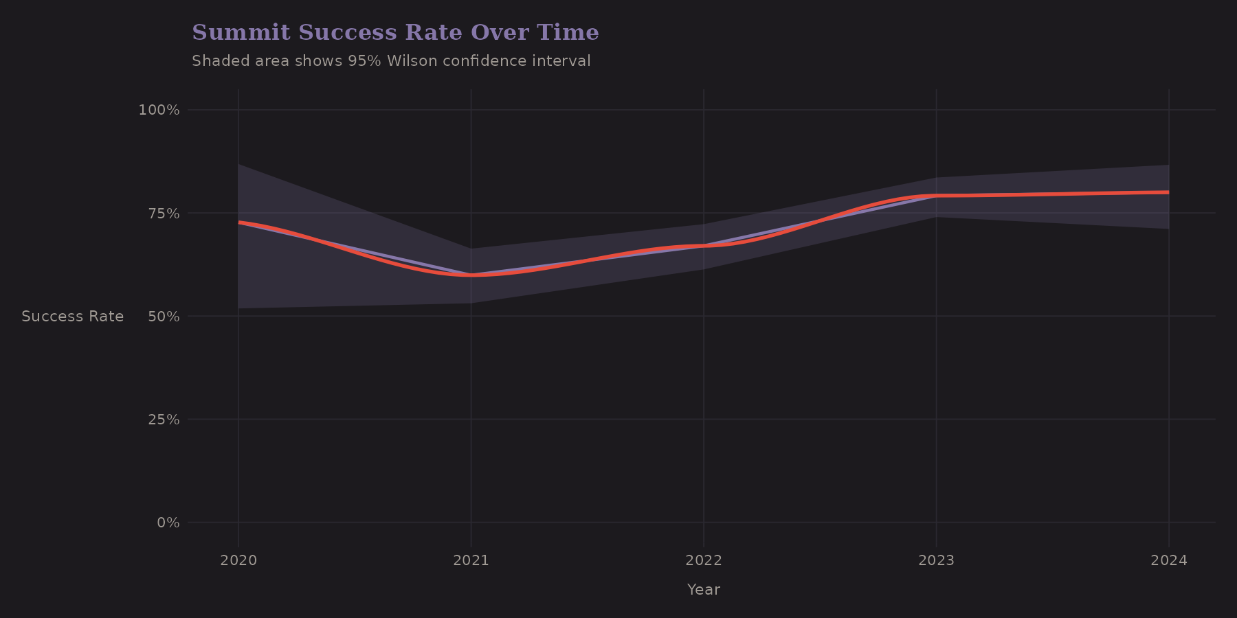
The shaded region shows Wilson confidence intervals—a better choice for proportions than the naive normal approximation, especially near 0 or 1.
Temporal trends matter for modeling. If success rates are improving over time (better gear, better forecasting, more experience), then a model trained on old data may underpredict future success. This is a form of distribution shift that's worth monitoring.
Season Distribution
Spring dominates Himalayan climbing. This isn't arbitrary—it's driven by the jet stream.
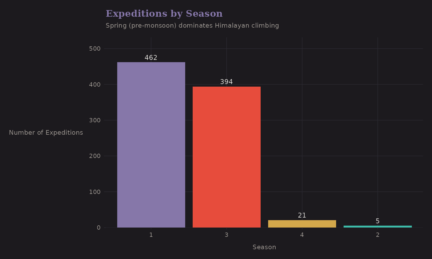
Most expeditions occur in Spring (pre-monsoon, roughly April-May) when the jet stream briefly lifts off the high peaks. Autumn (post-monsoon, roughly September-October) is the secondary season.
Does season affect success?
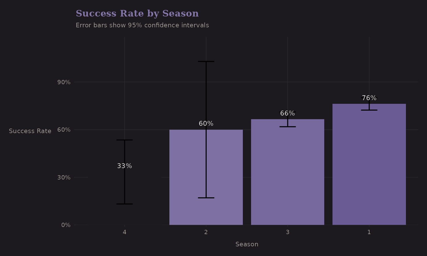
| Season | n | Success Rate |
|---|---|---|
| Spring | 462 | 76.2% |
| Autumn | 394 | 66.5% |
| Winter | 21 | 33.3% |
| Summer | 5 | 60.0% |
The pattern here is interesting. Spring has the highest volume and the highest success rate (76%). Winter attempts are rare (n=21) and risky (33%)— the error bars are wide because sample sizes are small.
This is a case where main season vs off-season might be a useful binary encoding. The detailed 4-season breakdown adds complexity without much predictive gain once you've separated Spring/Autumn from Summer/Winter.
Team Composition
Team size has a non-linear relationship with success.
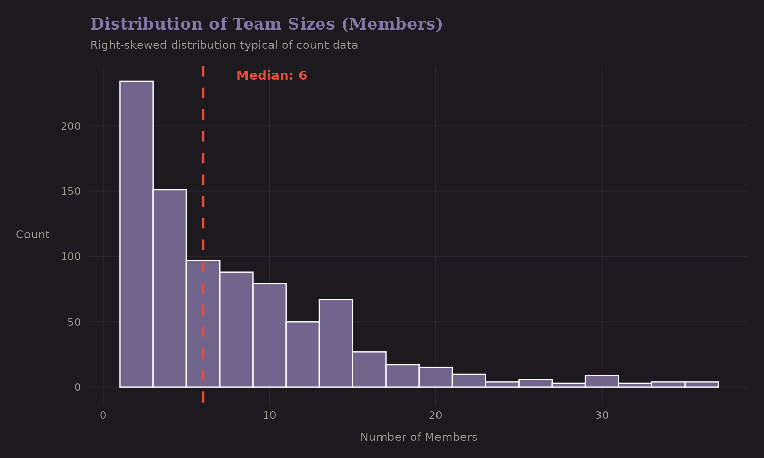
The distribution is right-skewed with a long tail. Most teams are small (2-6 members), but some commercial expeditions have 20+ members.
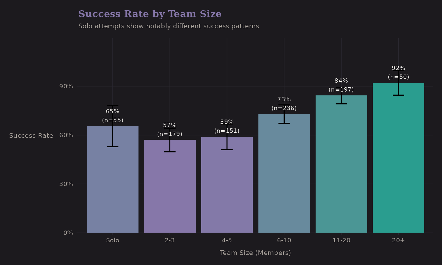
| Team Size | n | Success Rate |
|---|---|---|
| Solo | 55 | 65.5% |
| 2-3 | 193 | 59.6% |
| 4-5 | 151 | 58.9% |
| 6-10 | 236 | 72.9% |
| 11+ | 247 | 85.8% |
Solo attempts stand out—but not in the way you might expect. Solo climbers (65.5%) actually have higher success rates than small teams (2-5: ~59%), though lower than large teams (6+: 73-86%). This non-monotonic pattern suggests selection effects: solo climbers are likely elite alpinists attempting peaks they know well, while small teams may include less experienced climbers without the support infrastructure of large commercial expeditions.
This suggests is_solo should be a distinct indicator rather than treating
team size as purely continuous—the relationship isn't linear.
Staff Ratio
The ratio of hired staff (Sherpas, porters, guides) to team members captures something about expedition resources and style.
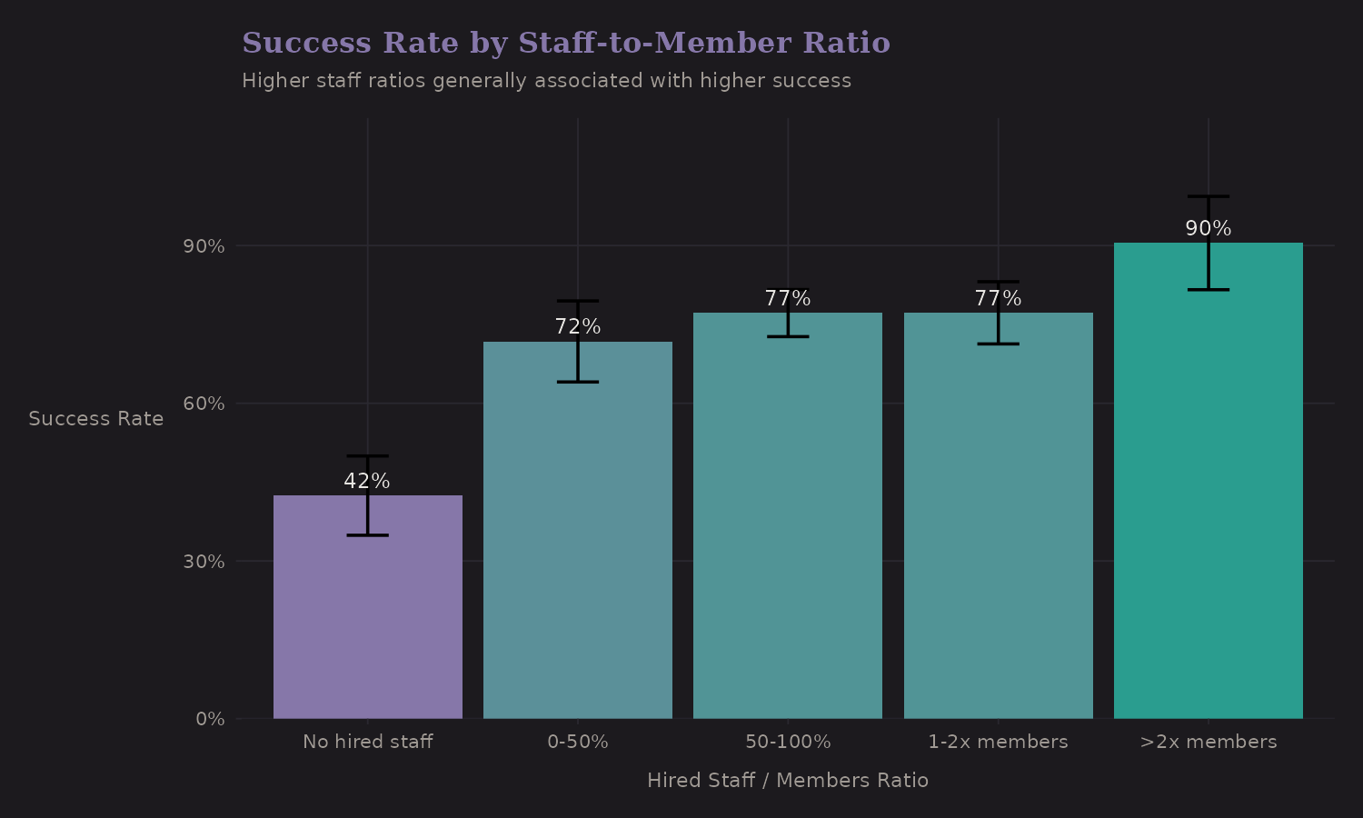
| Staff Ratio | n | Success Rate |
|---|---|---|
| No hired staff | 165 | 42.4% |
| Low (under 0.5) | 98 | 69.4% |
| Medium (0.5-1) | 209 | 79.9% |
| High (1-2) | 313 | 77.6% |
| Very high (2+) | 97 | 78.4% |
Higher staff ratios correlate with better outcomes (42% → 78%). But this is heavily confounded—expeditions with high staff ratios tend to be:
- Commercial (more resources)
- On popular routes (established infrastructure)
- Better funded (can afford more support)
The staff ratio is a proxy for multiple underlying factors. In a predictive model it's useful; for causal inference it's problematic.
Oxygen Use
Supplemental oxygen is one of the strongest univariate predictors of success.
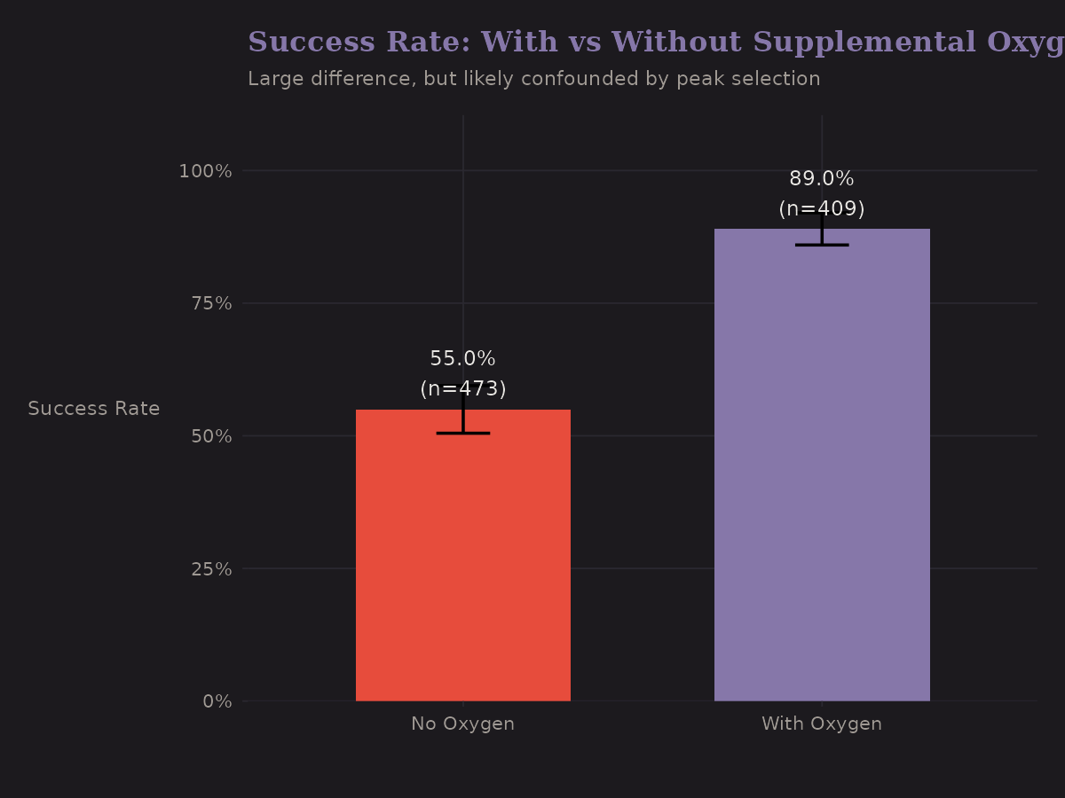
| Oxygen Use | n | Success Rate |
|---|---|---|
| No O2 | 473 | 55.0% |
| With O2 | 409 | 89.0% |
The gap is dramatic (+34 pp). But—and I keep emphasizing this—oxygen use is endogenous. It's not randomly assigned. The expeditions that use oxygen are systematically different:
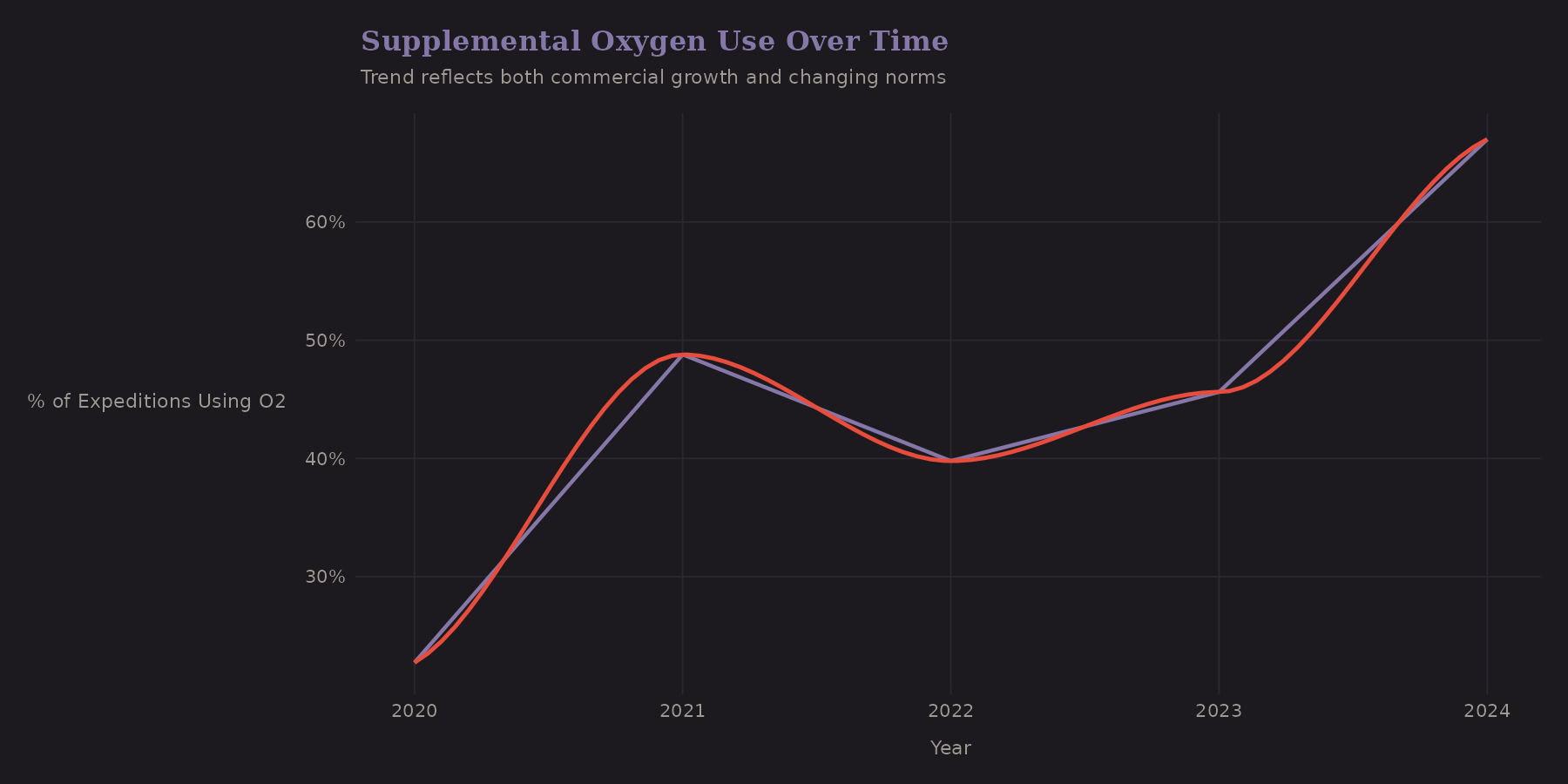
Oxygen use has been trending upward in this window. The commercialization of high-altitude mountaineering brings more clients who prefer (or require) supplemental oxygen.
A proper causal analysis would need to:
- Match expeditions on observable confounders (peak, season, year)
- Use instrumental variables (if any exist)
- Model selection into oxygen use explicitly
I don't do that here, but it's worth flagging. Interestingly, the naive correlation actually understates the causal effect—this is negative confounding. Oxygen users target harder peaks, which suppresses the apparent benefit. The adjusted effect (~55-62pp) is larger than the naive association (~34pp).
Peak-Level Analysis
This is where the hierarchical structure becomes visible.
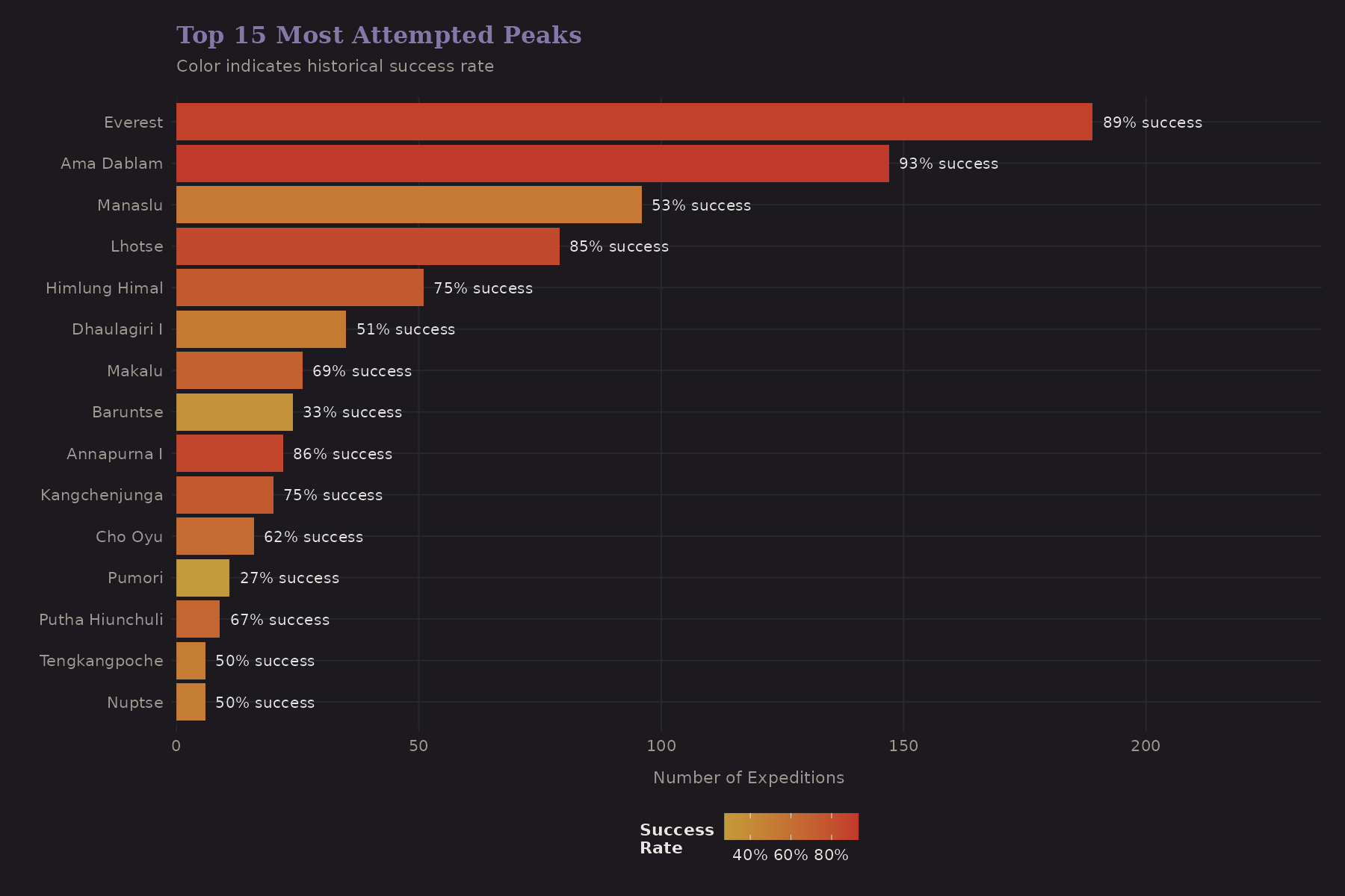
Everest dominates. Cho Oyu, Manaslu, and Ama Dablam are also popular. The color gradient shows success rates—notice how they vary substantially across peaks.
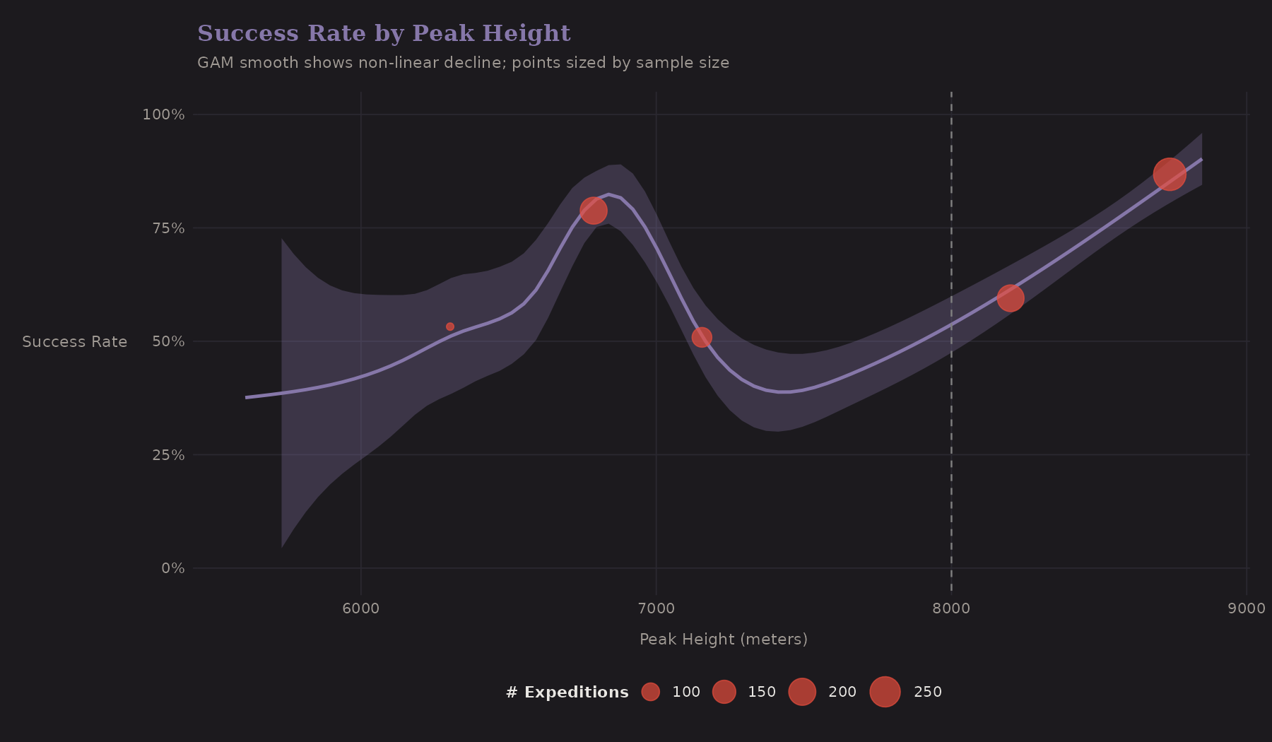
The GAM smooth shows a non-linear decline. Success rates hold steady until about 7,500m, then drop sharply. The 8,000m threshold (dashed line) marks the Death Zone.
Peak Variation
This plot is important for understanding why hierarchical models matter:
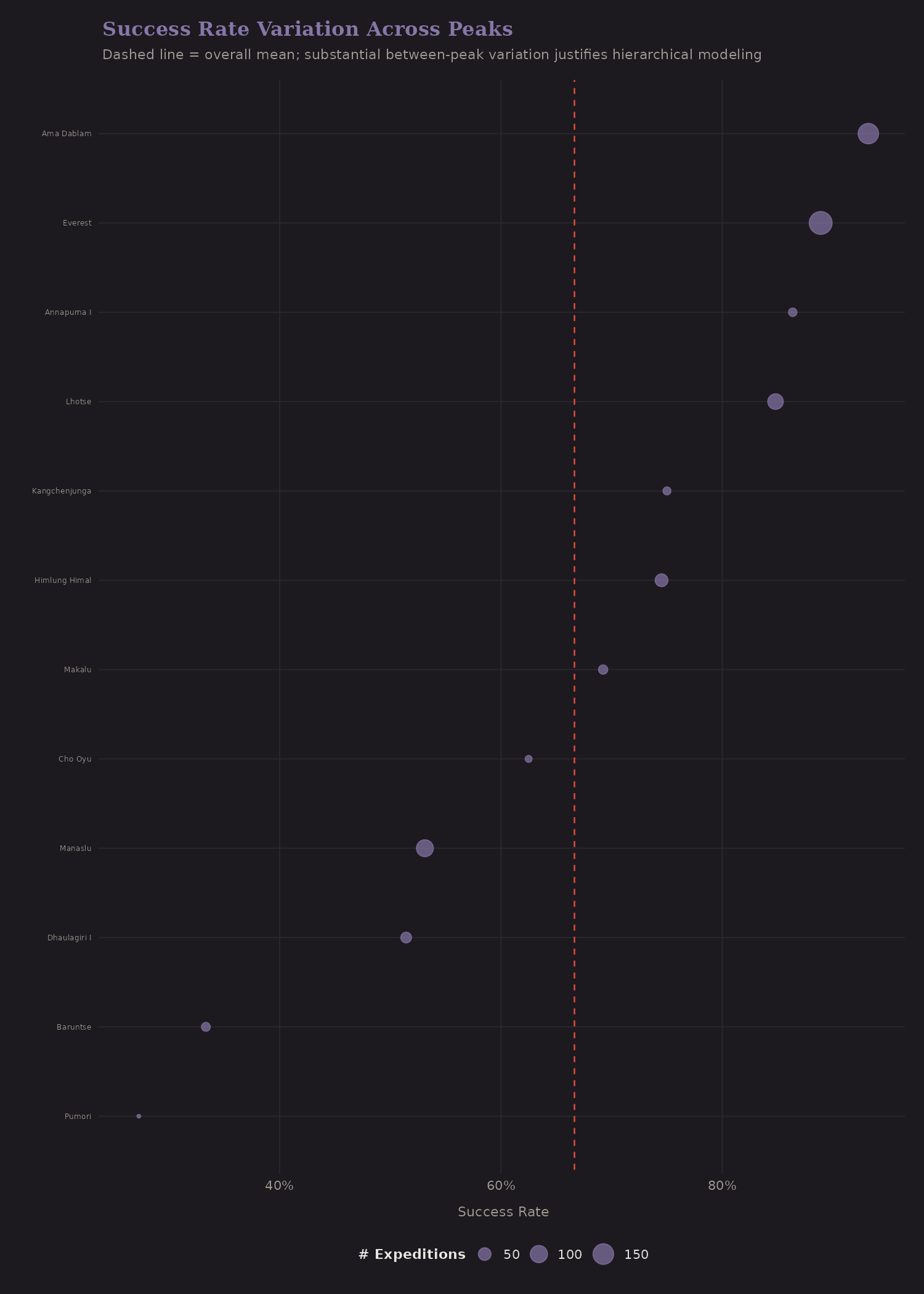
Each dot is a peak (with 10+ expeditions). The horizontal spread shows between-peak variation. Some peaks have 80%+ success rates; others are below 30%. This variation is partly explained by height, but not entirely—route difficulty, weather patterns, and infrastructure differ.
The dashed line is the overall mean. Peaks with few expeditions and extreme success rates are good candidates for shrinkage—we shouldn't fully trust a 100% rate from 3 expeditions.
Risk and Termination
Why do expeditions end? The termination reasons tell a story.
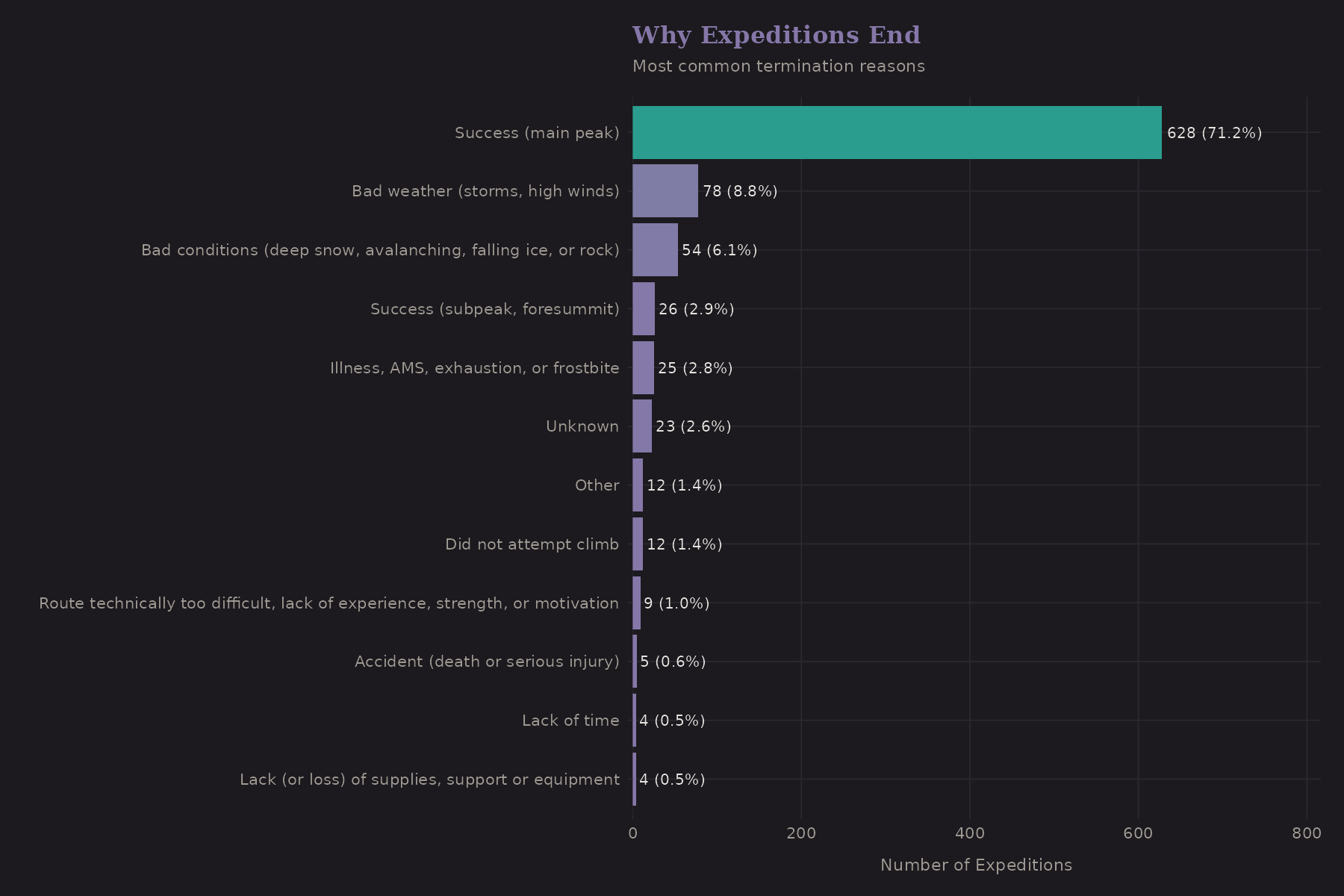
"Success" is the most common reason—which is good. But weather, route conditions, and team issues are significant. Deaths are relatively rare (thankfully), but they do occur.
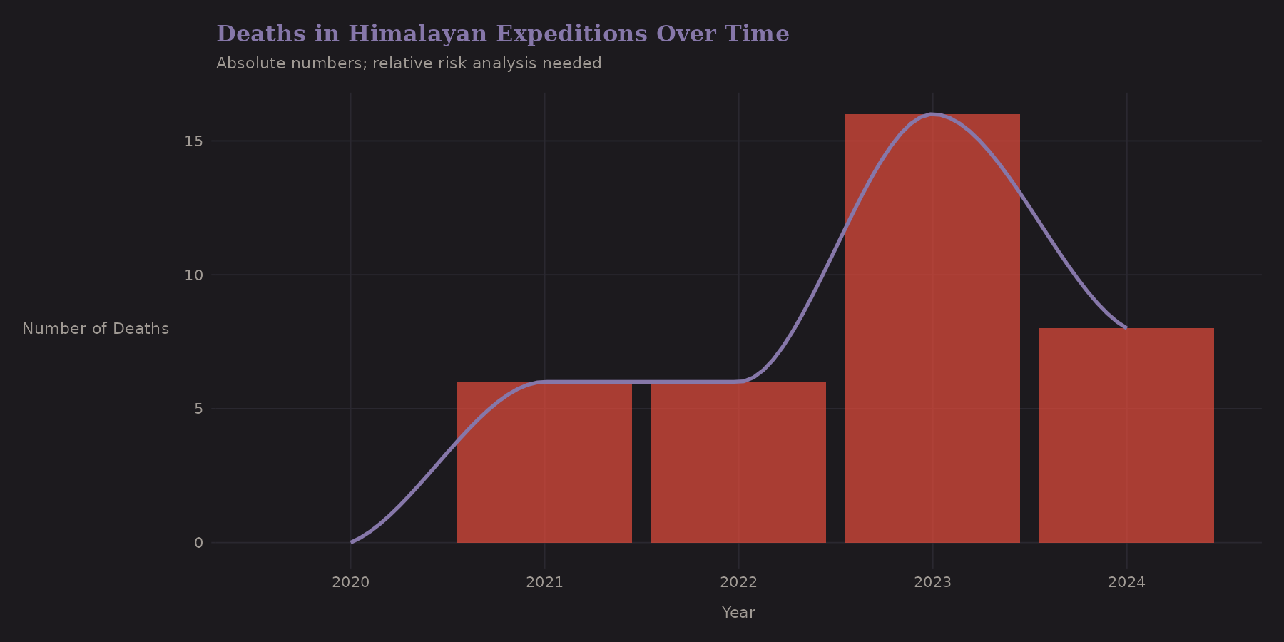
Deaths are low-count events—typically single digits per year in this dataset. Modeling mortality would require different techniques: Poisson regression, zero-inflation, or a two-stage model (any death? → how many?).
Correlation Structure
Before modeling, it's useful to check which predictors are correlated.
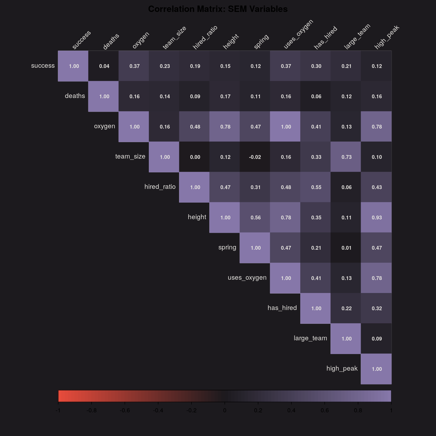
Some expected patterns:
totmembersandtothiredare positively correlated (bigger expeditions bring more staff)o2usedandheightmare correlated (oxygen more common on higher peaks)success1correlates witho2used(the confounded association we discussed)
High correlation between predictors can cause multicollinearity in regression. For prediction it's less of a concern, but for interpretation it matters.
Bayesian Preview
I'll cover Bayesian shrinkage properly in the next post, but here's a preview.
The overall success rate can be estimated with a Beta-Binomial model:
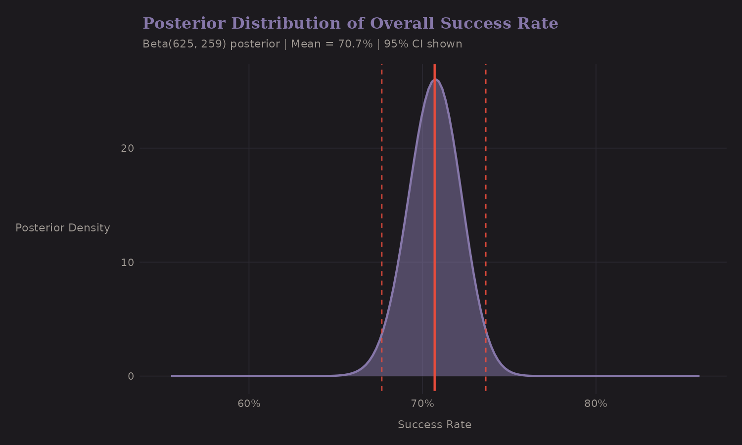
This posterior distribution captures our uncertainty about the true success rate. The 95% credible interval is tight because we have hundreds of observations.
The more interesting application is per-peak shrinkage:
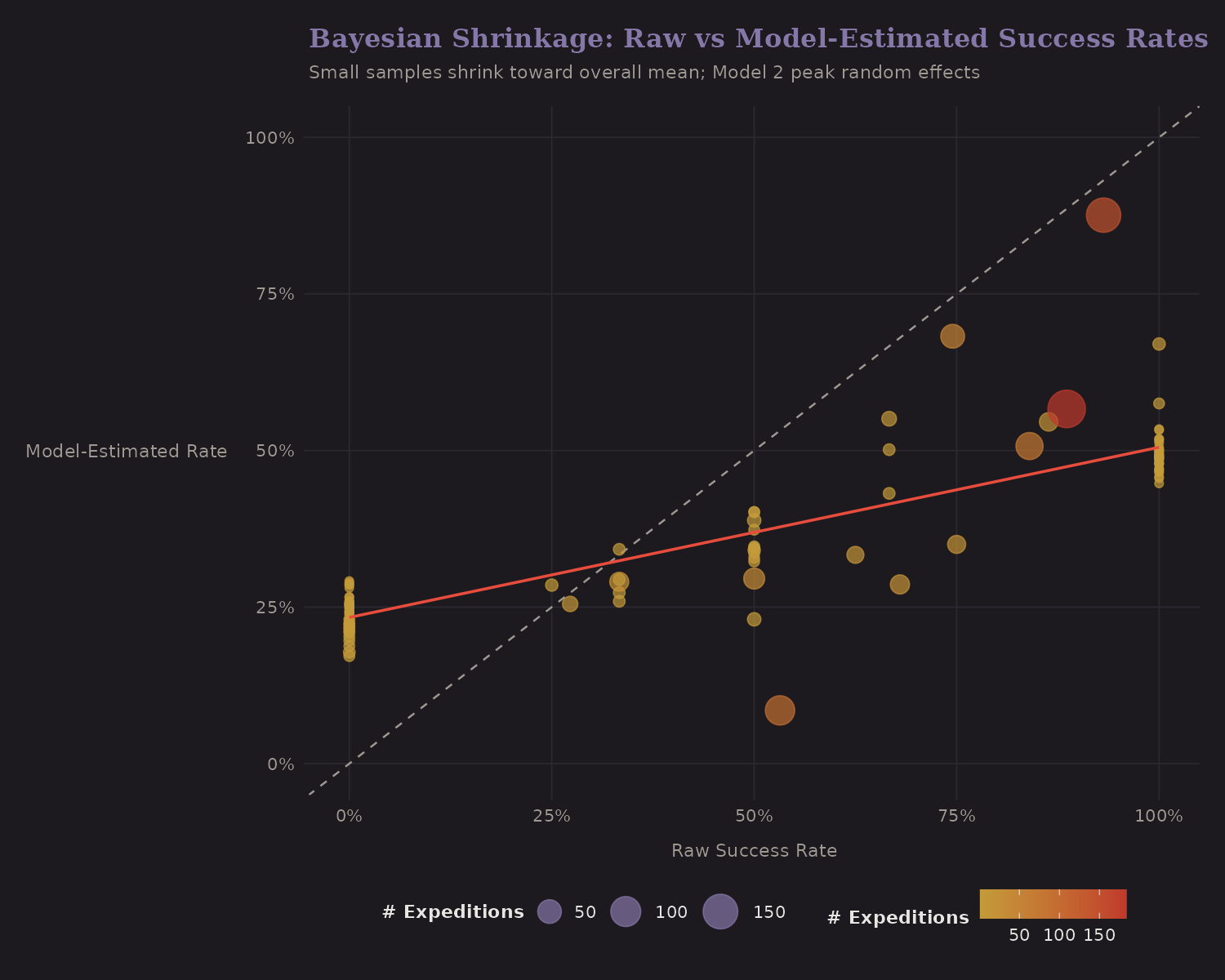
The dotted diagonal (45°) represents "no shrinkage"—where raw and shrunk estimates would be equal. The orange fitted line shows the actual relationship: it has a shallower slope, meaning extreme raw rates get pulled toward the mean. Small-sample peaks (small dots) shrink more than high-sample peaks (large dots).
This is Empirical Bayes in action. It's the same idea behind baseball batting average shrinkage, hospital quality metrics, and the James-Stein estimator. The next post develops this further.
What I Learned
A few takeaways from EDA:
-
Missing data is informative. Routes, summit dates, and other fields have patterns that relate to outcomes.
-
Team composition matters non-linearly. Solo attempts are distinct; the effect of additional team members diminishes.
-
Oxygen is confounded. The naive association understates causality.
-
Peaks vary substantially. Between-peak variation justifies hierarchical modeling.
-
Height has a threshold effect. The 8,000m mark isn't just symbolic— it's where physiology and success rates shift.
The next post translates these findings into features for modeling.