Feature Engineering and Shrinkage
This is the third post in a series on Himalayan mountaineering data. The first post introduced the dataset; the second covered exploratory analysis. Here I'll translate EDA findings into engineered features and dig into Bayesian shrinkage.
Feature engineering is where domain knowledge meets statistics. The raw variables in a dataset are rarely the right inputs for a model—you need to transform, categorize, and create derived features that capture the relationships you discovered in EDA.
Feature Categories
Based on the EDA, I created features in six categories:
- Temporal – year effects, learning curves, crowding
- Team composition – sizes, ratios, solo indicators
- Peak characteristics – height, difficulty, popularity
- Environmental – season, oxygen interactions
- Outcome/risk – death rates, summit proportions
- Missingness – indicators for structurally missing data
Let me walk through the highlights.
Temporal Features
Year Centering
For regression models, centering the year variable helps interpretation. The intercept then represents the outcome at the "middle" year rather than year 0.
median_year <- median(exped$year)
exped <- exped %>%
  mutate(year_centered = year - median_year)
Learning Curves
Peaks that have been climbed longer may have better-established routes and
more accumulated knowledge. The years_since_first_ascent feature captures
this.
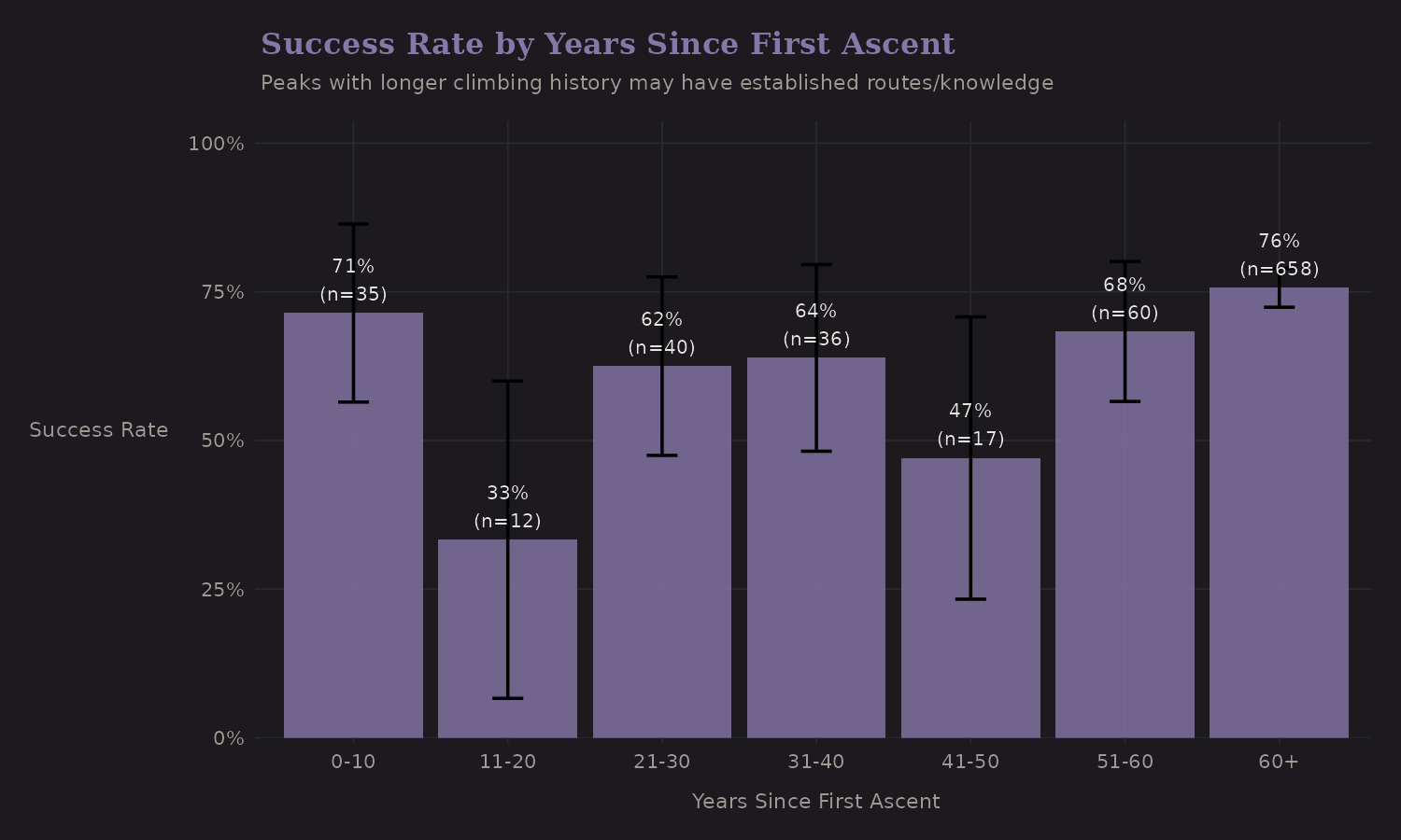
The pattern isn't dramatic, but peaks with longer climbing history show slightly different success patterns. This makes intuitive sense—route beta accumulates over time.
Crowding Effects
More expeditions on a peak in a given year could mean:
-
Better infrastructure (fixed lines, camps)
-
Competition for summit windows
-
Congestion at key points (the "traffic jam" problem)
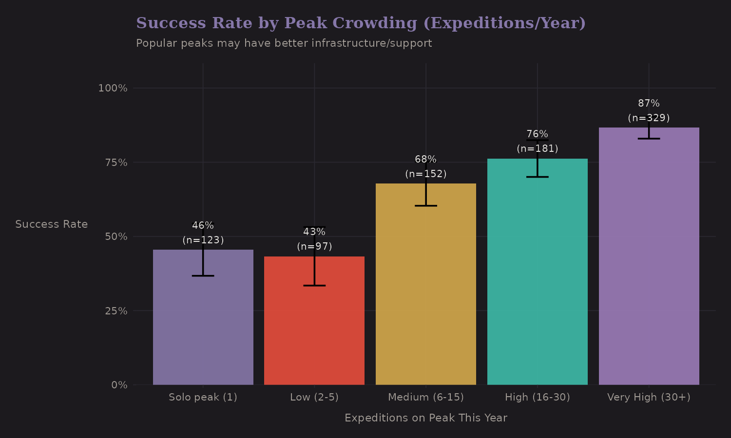
Popular peaks (high crowding) actually show higher success rates. This is probably selection—popular peaks are popular because they're achievable. The causation might run both ways.
Team Composition Features
Categorical Team Size
Based on EDA, I created team size categories that capture the non-linear relationship with success:
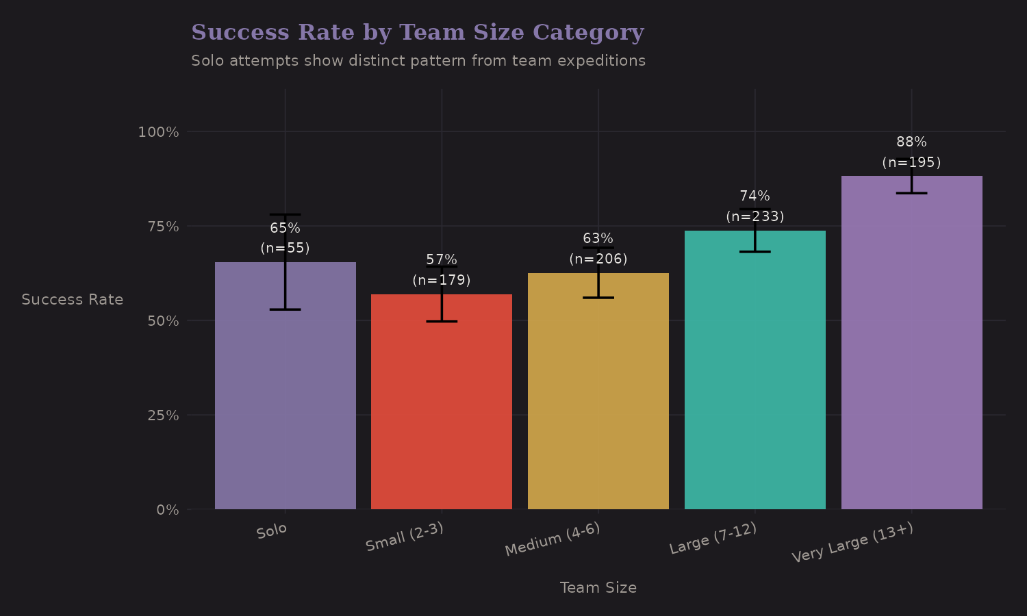
| Team Size | n | Success Rate |
|---|---|---|
| Solo | 55 | 65.5% |
| 2-3 | 193 | 59.6% |
| 4-5 | 151 | 58.9% |
| 6-10 | 236 | 72.9% |
| 11+ | 247 | 85.8% |
Solo attempts (65.5%) outperform small teams (2-5 members: ~59%) but
underperform large teams (6+: 73-86%). The is_solo binary indicator is
worth including separately from continuous team size—the relationship isn't
monotonic.
Staff Ratio Categories
The ratio of hired staff to members varies from 0 (fully self-supported) to 2+ (heavy support, typical of commercial expeditions).
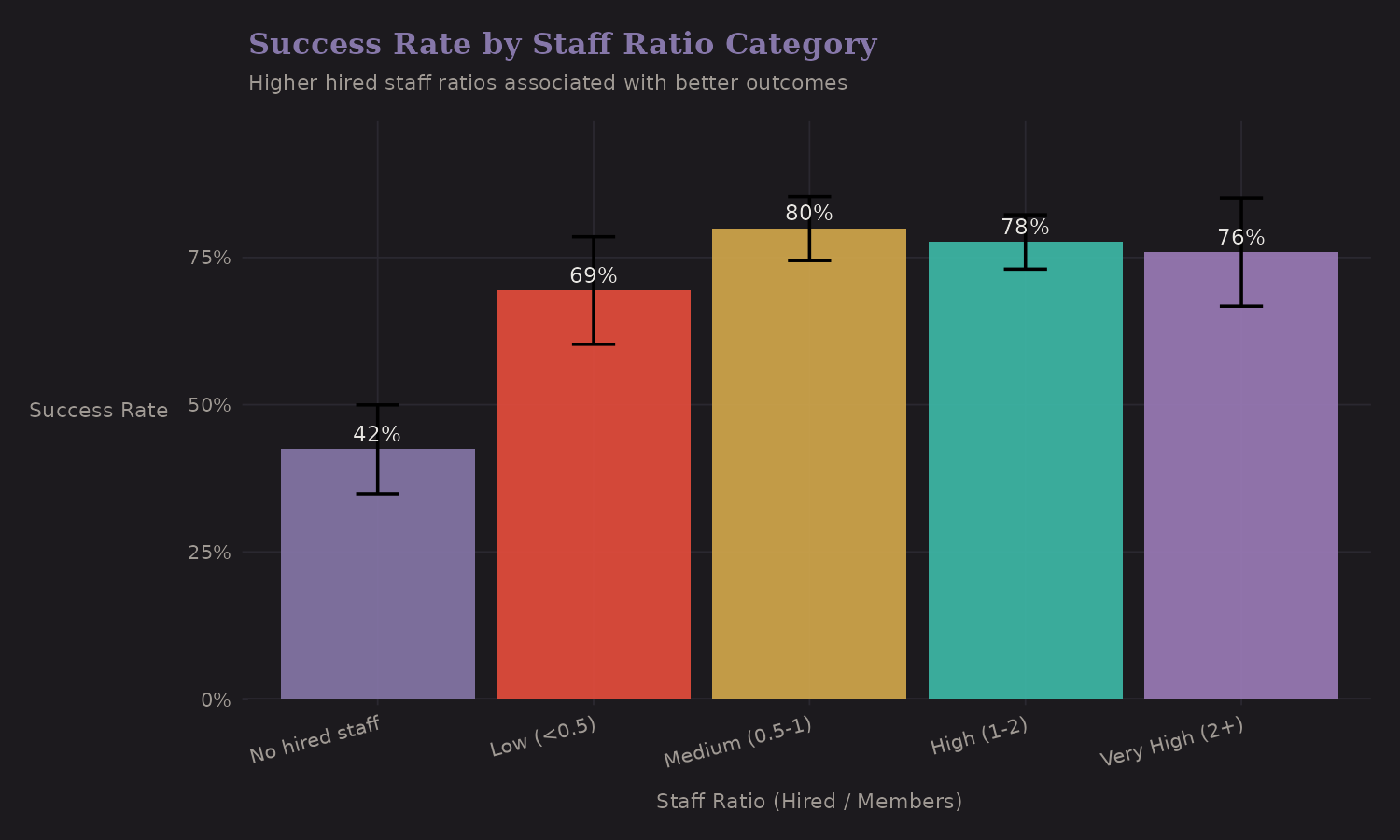
| Staff Ratio | n | Success Rate |
|---|---|---|
| No hired staff | 165 | 42.4% |
| Low (under 0.5) | 98 | 69.4% |
| Medium (0.5-1) | 209 | 79.9% |
| High (1-2) | 313 | 77.6% |
| Very high (2+) | 97 | 78.4% |
Higher staff ratios correlate with better outcomes (42% → 78%). But I want to reiterate: this is confounded with resources, commercial status, and peak selection. It's useful for prediction, hazardous for causal claims.
Peak Characteristics
Height Categories
The continuous height variable is useful, but a categorical version captures threshold effects:
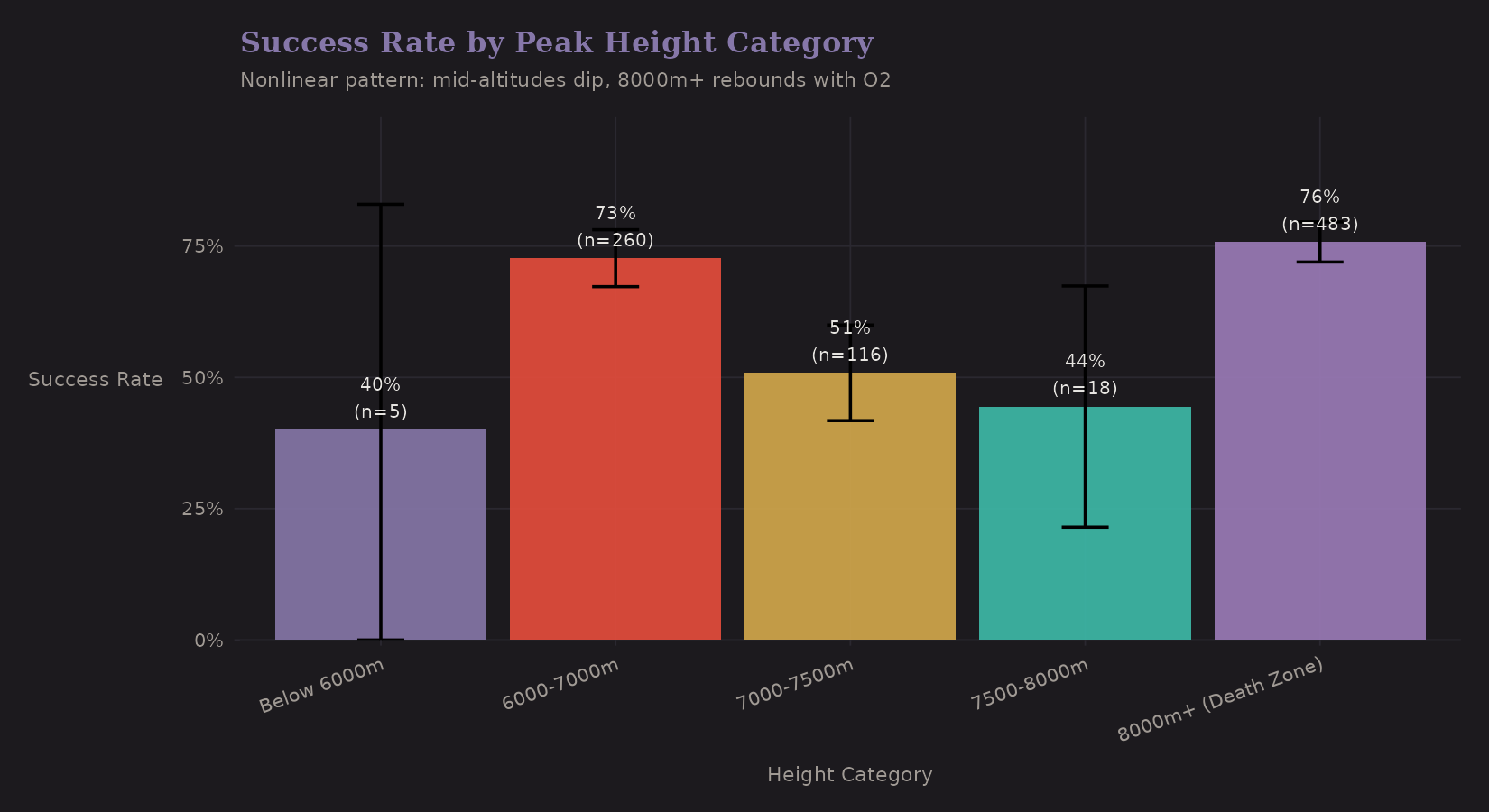
| Height Category | n | Success Rate | O2 Use |
|---|---|---|---|
| Below 7000m | 265 | 72.1% | 1.1% |
| 7000-7500m | 116 | 50.9% | 4.3% |
| 7500-8000m | 18 | 44.4% | 27.8% |
| 8000m+ (Death Zone) | 483 | 75.8% | 82.0% |
The pattern is surprising. The "8000m+ (Death Zone)" category actually has the highest success rate (75.8%), not the lowest. Why? Nearly universal oxygen use (82%) and well-resourced commercial expeditions on famous peaks like Everest. The middle ranges (7000-8000m) have the lowest rates (45-51%)— challenging enough to be difficult, but without the same support infrastructure.
Creating an is_8000m binary indicator captures this discontinuity, but the
effect is confounded with oxygen use and expedition resources.
Peak Difficulty Categories
This is where Bayesian shrinkage becomes practical. Raw peak success rates are noisy for peaks with few expeditions. Empirical Bayes shrinks them toward the overall mean:
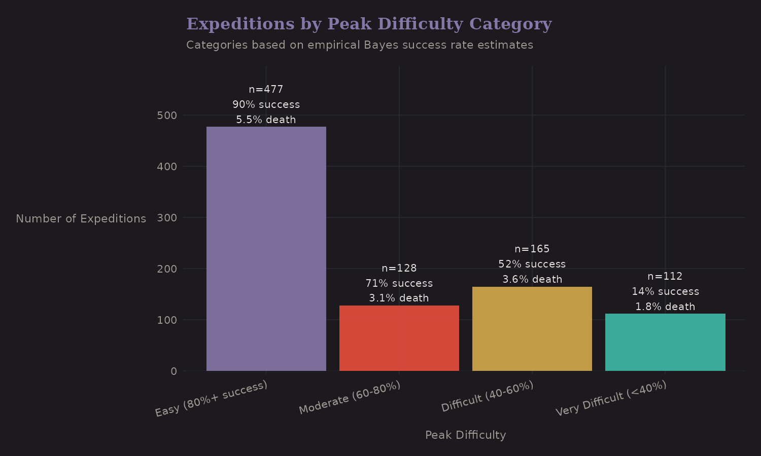
The categories (Easy, Moderate, Difficult, Very Difficult) are based on shrunk success rates, not raw rates. This gives more stable classifications.
Empirical Bayes Shrinkage
This deserves its own section because it's a powerful technique that transfers across domains.
The Problem
Say Peak A has 3 expeditions, all successful (100% raw rate). Peak B has 50 expeditions with 35 successes (70% raw rate). Which peak is "easier"?
Your gut probably says "we're not sure about Peak A"—and that's correct. The 100% rate is based on too little data. We should shrink it toward the overall mean.
The Solution
Empirical Bayes uses a two-stage approach:
- Estimate a prior from the data (across all peaks)
- Update each peak's estimate using its local data
The math:
Prior: Beta(α, β) estimated from across-peak variation
Posterior for peak i: Beta(α + successes_i, β + failures_i)
Peaks with more data get posteriors closer to their raw rates. Peaks with less data get pulled toward the prior.
Validation
Here's the key visualization:
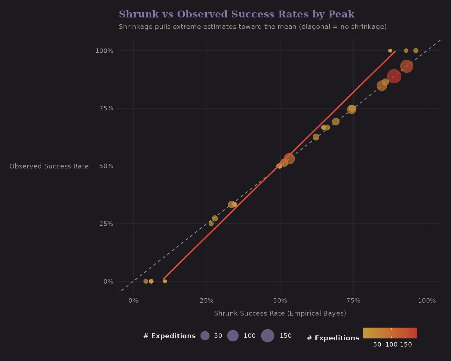
The diagonal line is "no shrinkage." Points on this line have shrunk rate = raw rate. But notice:
- Small peaks (small dots) are pulled toward the overall mean (horizontal dotted line)
- Large peaks (large dots) stay closer to their raw rates
This is the James-Stein effect in action. It's provably optimal under squared error loss, and it makes intuitive sense: trust data proportional to sample size.
Leakage warning (important): peak_success_shrunk is computed using the
full dataset, including each expedition's own outcome. That's fine for
descriptive EDA, but it's leakage if you use it as a predictor in a
model. For prediction, compute shrinkage within training folds only (I
implemented a fold-wise version, peak_success_shrunk_cv, in the code).
Why This Matters
Shrinkage estimators show up everywhere:
- Baseball: Batting averages, ERA
- Healthcare: Hospital mortality rates, surgical outcomes
- Finance: Fund manager alpha estimates
- A/B testing: Variant effect sizes
If you have grouped data with unequal sample sizes, you probably want some form of shrinkage. The Himalaya data is a nice illustration because the groups (peaks) are concrete and interpretable.
Environmental Features
Oxygen by Height
Oxygen use varies dramatically with altitude:
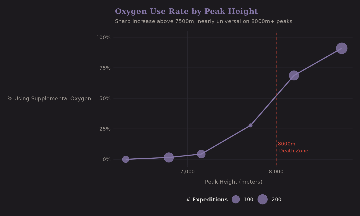
Below 7,000m, oxygen is uncommon. Above 8,000m, it's nearly universal. This non-linear pattern suggests interaction terms:
o2_for_8000m: Oxygen use on Death Zone peakso2_for_non8000m: Oxygen use on lower peaks
Oxygen Benefit by Height
Does oxygen help equally at all altitudes?
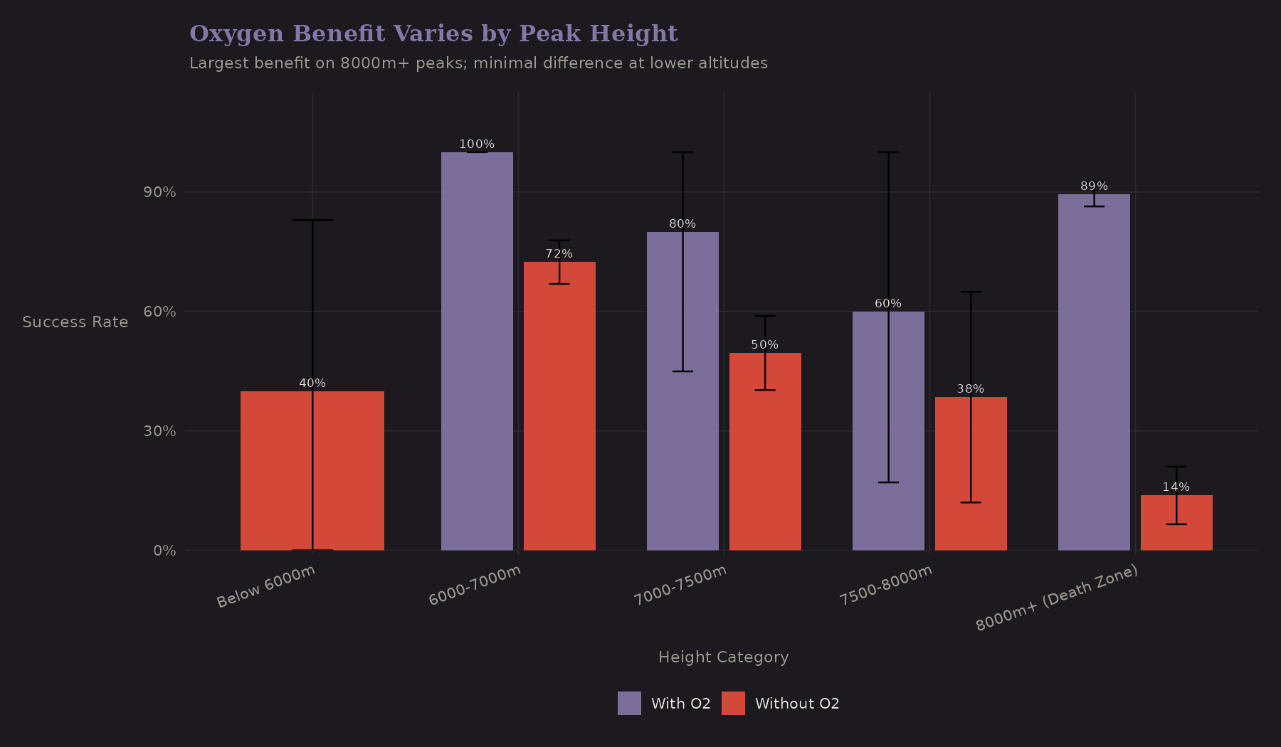
| Height | No O2 | With O2 | O2 Benefit | n (O2) |
|---|---|---|---|---|
| 7000-8000m | 48.4% | 70.0% | +21.6 pp | 10 |
| 8000m+ | 13.8% | 89.4% | +75.6 pp | 396 |
| Below 7000m | 71.8% | 100%* | +28.2 pp | 3* |
*Only 3 expeditions used O2 below 7000m—estimate unreliable.
The gap between "With O2" and "Without O2" grows dramatically with altitude. At 7000-8000m the benefit is ~22pp; at 8000m+ it's ~76pp. This is a heterogeneous treatment effect—oxygen's benefit varies by context. A model with just a main effect for oxygen would miss this. Interaction terms or subgroup analysis are needed.
Season × Difficulty
Do seasonal effects vary by peak difficulty?
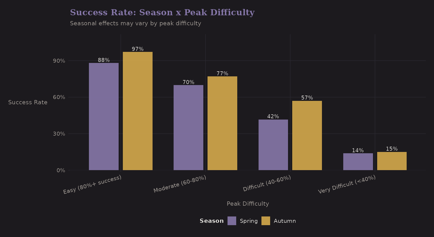
Surprisingly, Autumn outperforms Spring across all difficulty categories. The pattern varies by difficulty:
| Difficulty | Autumn | Spring | Difference |
|---|---|---|---|
| Easy (80%+) | 97% | 88% | Autumn +9 pp |
| Moderate (60-80%) | 77% | 70% | Autumn +7 pp |
| Difficult (40-60%) | 57% | 42% | Autumn +15 pp |
| Very Difficult (under 40%) | 15% | 14% | ~Same |
This is counterintuitive—conventional wisdom favors Spring. The Autumn advantage is largest on "Difficult" peaks, but nearly vanishes on very difficult peaks where success rates are low regardless of season. Selection effects may explain this: Spring attracts more commercial expeditions to popular (easier) peaks, diluting success rates there.
Death Rates
For completeness, here's death rate by height:
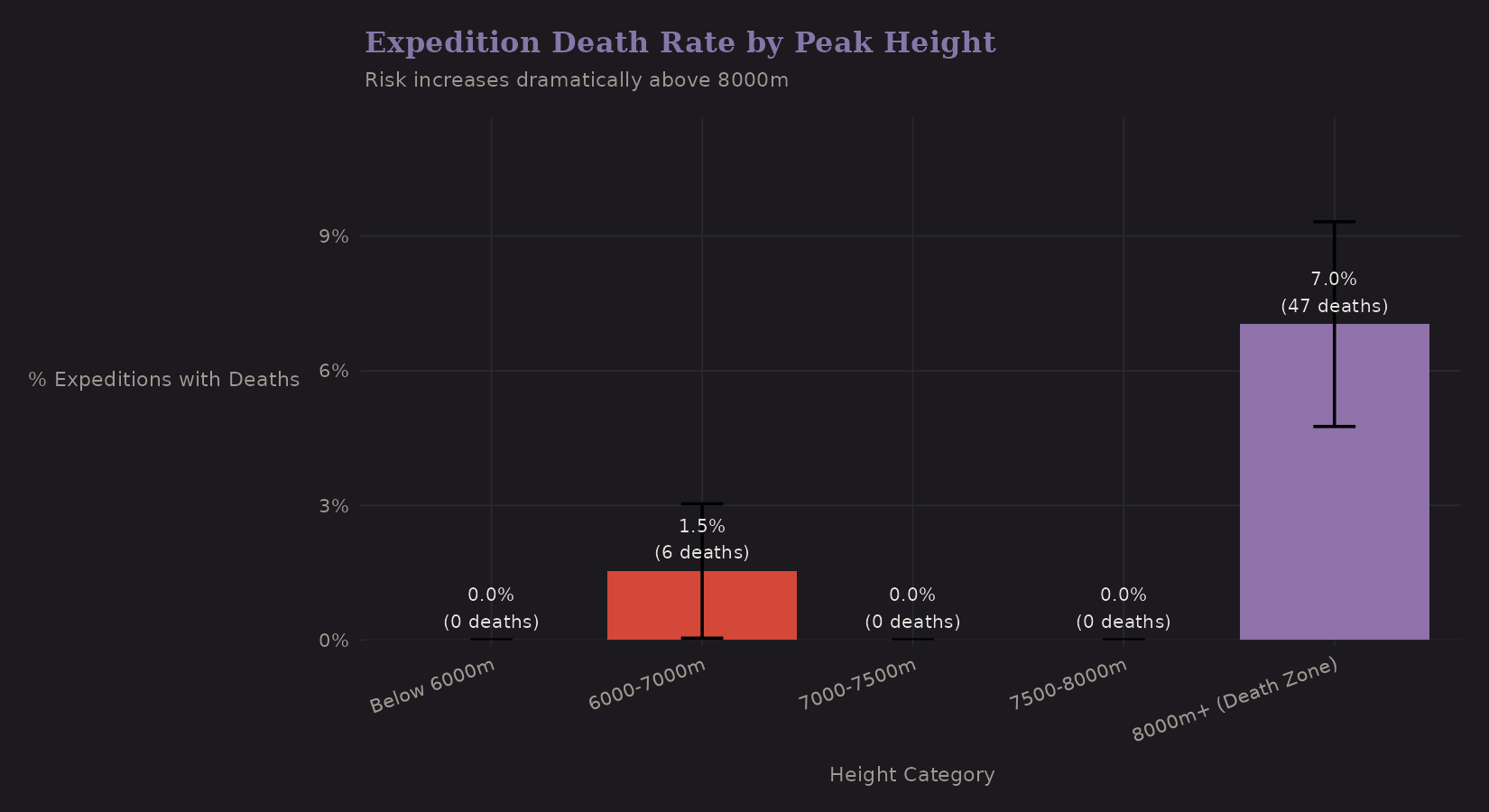
| Height | Expeditions | Total Deaths | Expeditions with Deaths | % with Deaths |
|---|---|---|---|---|
| Below 7000m | 265 | 6 | 4 | 1.51% |
| 7000-7500m | 116 | 0 | 0 | 0% |
| 7500-8000m | 18 | 0 | 0 | 0% |
| 8000m+ | 483 | 47 | 34 | 7.04% |
The 8,000m+ category has substantially higher death rates (7% vs 1.5% below 7000m). This isn't surprising—the Death Zone earned its name.
Modeling deaths requires different techniques than success. Deaths are:
- Rare (zero-inflated)
- Count data (Poisson or negative binomial)
- High-stakes (different loss function for false negatives)
I didn't build a death model here, but the features would transfer.
Feature Correlations
After engineering features, it's worth checking correlations:
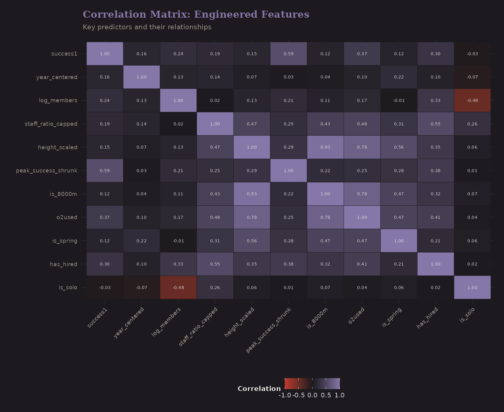
Key observations:
peak_success_shrunkcorrelates strongly withsuccess1(good—it's predictive)height_scalednegatively correlates with success (expected)o2usedcorrelates withis_8000m(confounding we discussed)log_membersandhas_hiredare correlated (bigger teams tend to have hired staff)
High correlations between predictors can cause multicollinearity. Regularized regression (ridge, lasso) handles this better than OLS.
Predictor Summary
A quick visual summary of key binary predictors:
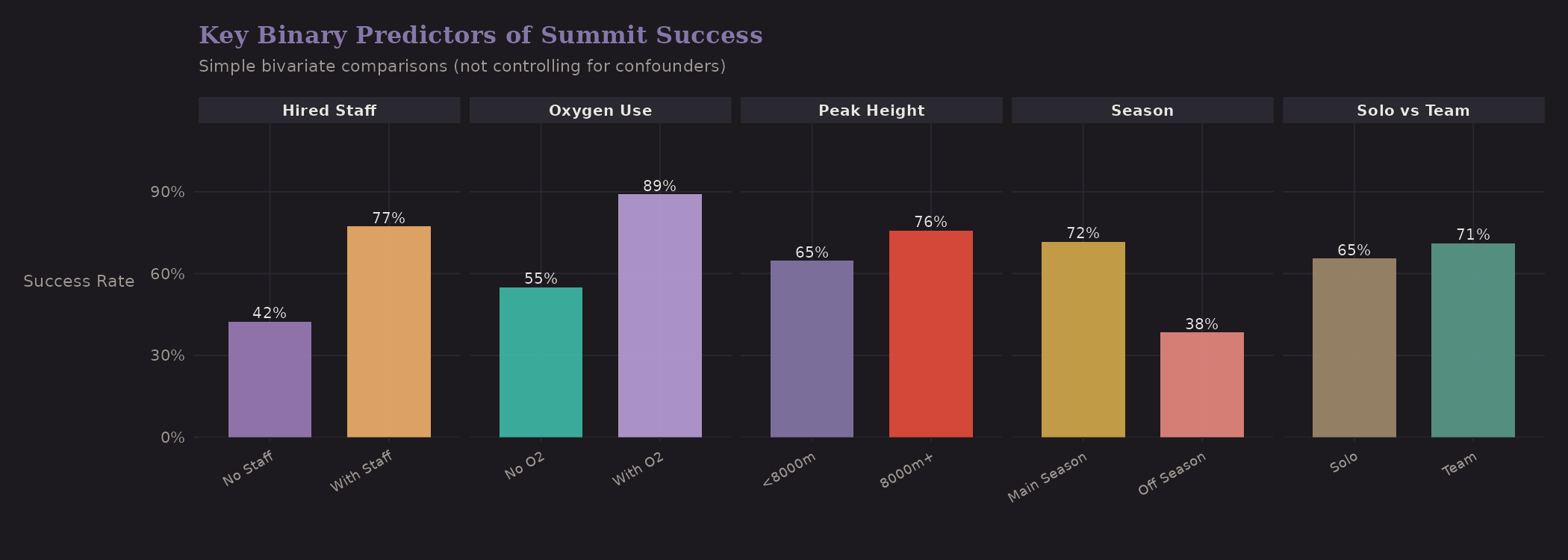
These are univariate comparisons—not controlling for confounders. But they show the raw signal:
| Comparison | Group A | Group B | Difference |
|---|---|---|---|
| Solo vs Team | 65.5% | 71.1% | Team +5.6 pp |
| Oxygen | No O2: 55.0% | With O2: 89.0% | O2 +34 pp |
| Peak Height | Below 8000m: 64.7% | 8000m+: 75.8% | 8000m+ higher* |
| Season | Autumn: 66.5% | Spring: 76.2% | Spring +9.7 pp |
| Hired Staff | None: 42.4% | Has staff: 77.3% | Staff +34.9 pp |
*8000m+ has higher success due to near-universal oxygen use—a confounded comparison.
Univariate Importance
Ranking features by correlation with success:
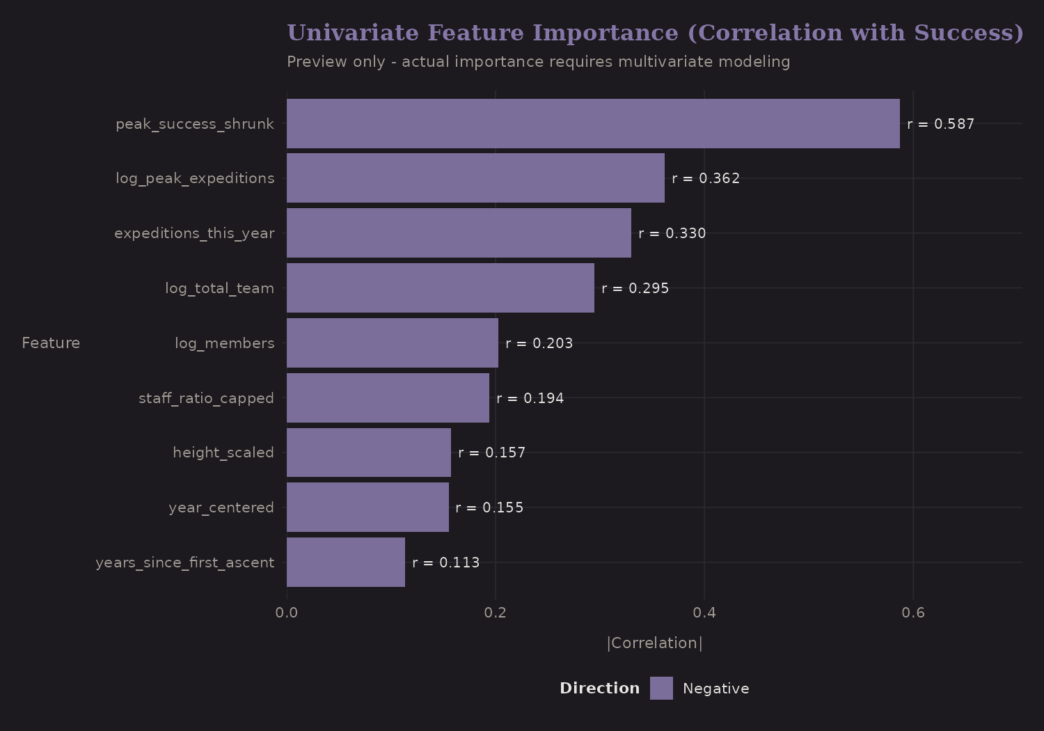
peak_success_shrunk has the strongest correlation—which makes sense, it's
derived from success itself. The danger is leakage if you're not careful.
For prediction on new peaks, you'd need to compute shrunk estimates from
training data only.
Modeling Recommendations
Based on this feature engineering, here's what I'd recommend for modeling:
Hierarchical/Multilevel Model
The data has natural hierarchy: expeditions within peaks. A mixed-effects
logistic regression with peakid as a random effect would:
- Account for within-peak correlation
- Shrink peak-level estimates automatically
- Allow peak-level predictors (height, difficulty)
In R, using lme4 or brms:
# Frequentist
glmer(success1 ~ height_scaled + o2used + log_members +
        is_solo + is_spring + (1 | peakid),
      family = binomial, data = exped)

# Bayesian
brm(success1 ~ height_scaled + o2used + log_members +
      is_solo + is_spring + (1 | peakid),
    family = bernoulli, data = exped)
Cross-Validation Strategy
For honest evaluation:
- Temporal split: Train on 2020-2022, test on 2023-2024
- Peak-level split: Train on some peaks, test on held-out peaks
- Grouped CV: Ensure peaks don't leak between folds
The choice depends on your use case. If predicting future expeditions on known peaks, temporal split makes sense. If predicting new peaks, peak-level split is more relevant.
Causal Analysis (Optional)
If you want to estimate the causal effect of oxygen:
- Matching: Match O2 vs no-O2 expeditions on peak, season, year
- Propensity scores: Model P(O2 | covariates), weight or stratify
- Instrumental variables: Hard to find a good instrument here
I didn't pursue causal analysis, but the engineered features would support it.
What I Learned
A few transferable insights:
-
Shrinkage is your friend. When you have grouped data with unequal sample sizes, raw rates are noisy. Empirical Bayes (or hierarchical models) provides principled regularization.
-
Interactions matter. The oxygen benefit varies by altitude. Season effects may vary by difficulty. A model with only main effects misses this.
-
Feature engineering is domain-driven. The "right" features depend on understanding the data-generating process. EDA reveals structure; feature engineering encodes it.
-
Confounding is everywhere. The naive oxygen association understates causality. Staff ratio conflates resources with skill. Skepticism is warranted.
-
Hierarchical structure is common. Expeditions within peaks, patients within hospitals, students within schools—the patterns transfer. Learning to think hierarchically pays dividends.
Resources
If you want to go deeper:
- Gelman & Hill: Data Analysis Using Regression and Multilevel/Hierarchical Models—the classic text on hierarchical modeling
- McElreath: Statistical Rethinking—Bayesian modeling with good intuition
- tidymodels: R framework for feature engineering and modeling
- brms: Bayesian regression modeling in R (highly recommended)
The Himalaya data is available from TidyTuesday if you want to reproduce this analysis or try your own models.
What's Next
The next post puts these features to work in
Bayesian hierarchical models using brms and Stan—partial pooling,
shrinkage, and proper handling of the nested structure.